Rotterdam The Hague Airport Rebranding
Closer to…
Brief
Rotterdam The Hague Airport, a regional gateway with global ambition, faced a perception gap. In a category dominated by scale and spectacle, its strength — closeness — was undervalued.
Our insight was simple: in a world of mega-hubs and mass travel, proximity is power. People value familiarity, accessibility, and human scale.
Solution
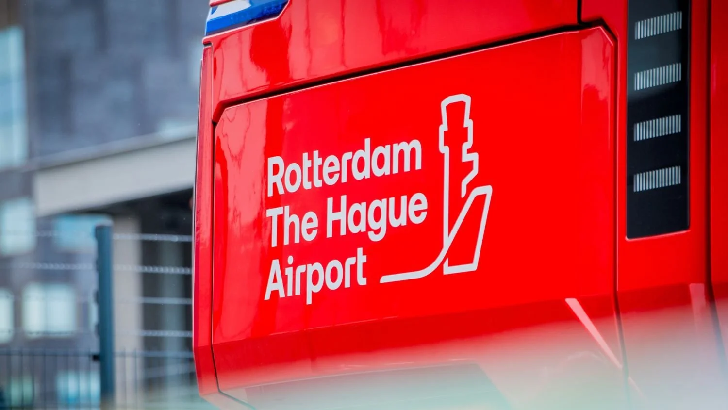
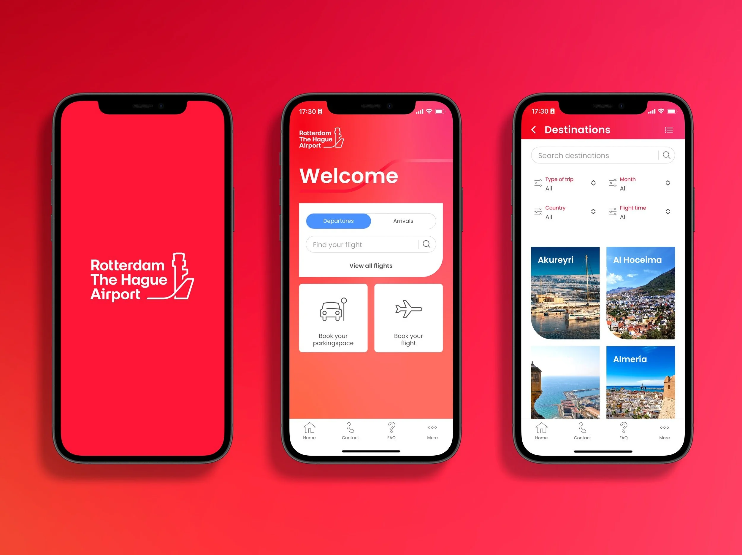
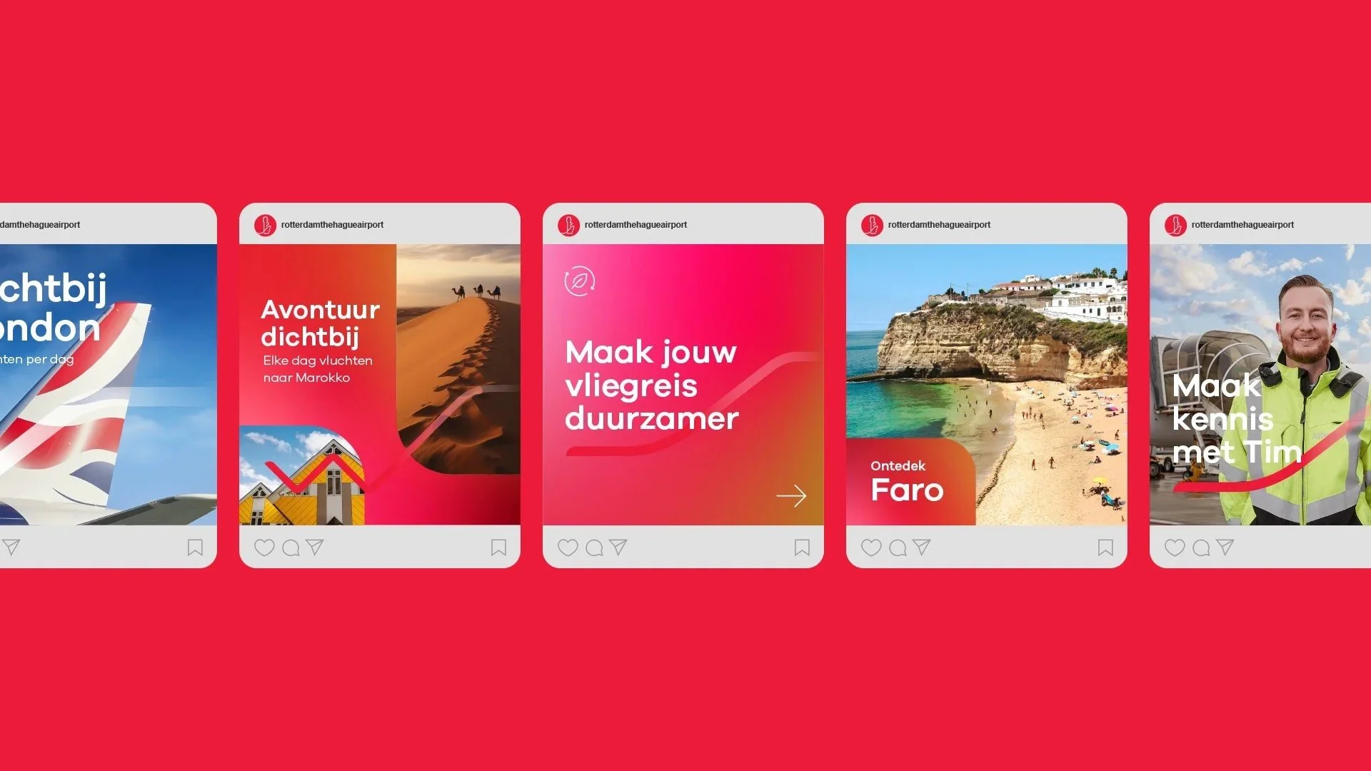
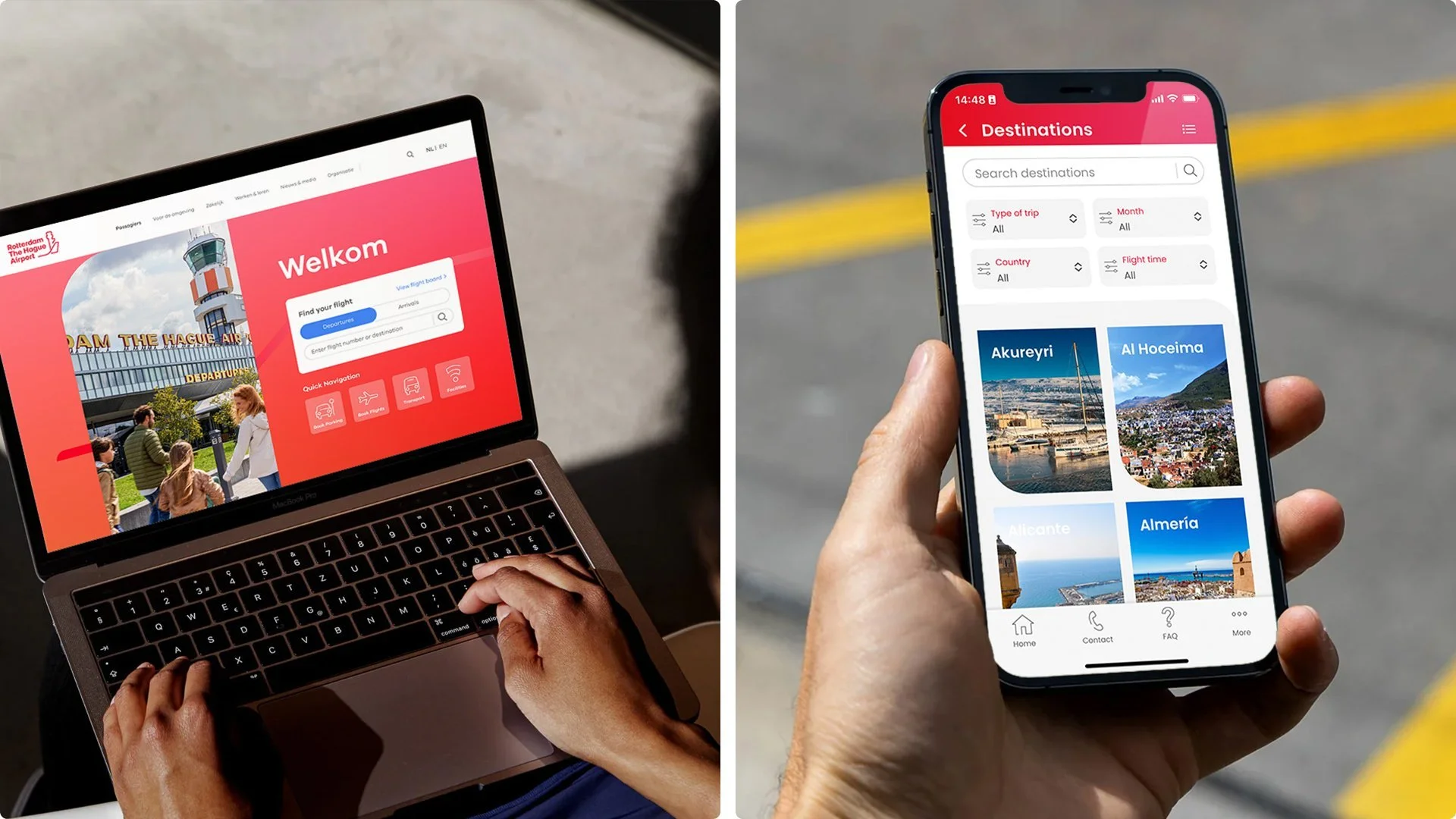
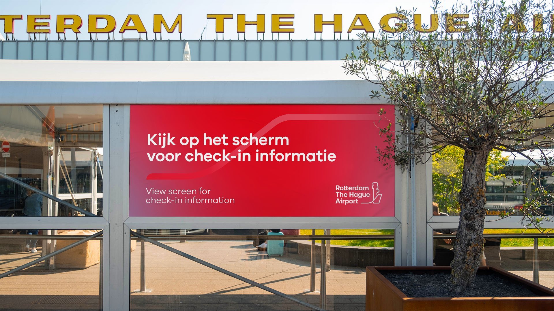
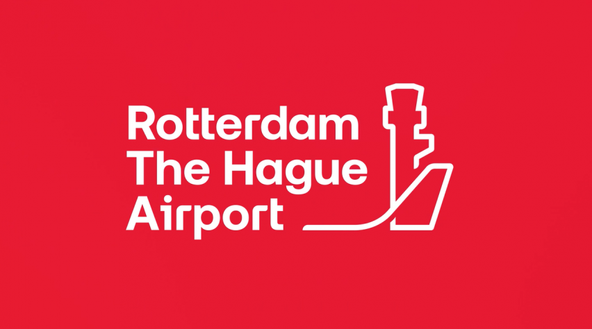
We fused Brand Design and Insight & Innovation to redefine closeness not as limitation, but as leadership. The idea was “Rotterdam The Hague Airport. Dichtbij.” — a positioning that celebrated literal and emotional proximity. It came alive through a new identity system featuring the iconic control tower in the logo, a warm, down-to-earth tone of voice, and a dynamic visual language that conveyed motion, even when still.
The result: renewed local relevance, stronger internal alignment, and a revitalised brand platform ready for commercial, corporate, and service communications. More than a rebrand, it reasserted the airport’s role — connecting region to world, and aviation to its future.